Generate complete color palettes variable in Figma with one click
Generate complete color palettes instantly with shades and alpha values for comprehensive design systems
🎨 Why Start Your Design with Inked Colibri Realtime Color Variables
A Effective Starting Point
It doesn’t matter whether you begin your design in neutral grays or jump straight into colorful palettes — what matters is building on a flexible foundation.
Starting with Inked Calibri Realtime Color Variables means your design remains adaptable. Once your elements use these variables, you can switch to any color scheme or even convert everything to dark mode — all with a single click.
No manual recoloring. No broken styles. Just creative flow.
⚠️ Note: If you’re not sure how to generate colors, check out the previous article for guidance.
| Role | Purpose |
|---|---|
| Primary | The main brand or interface color |
| Secondary | A supporting tone that complements the primary |
| Accent | A highlight or emphasis color |
| Text | Usually a dark tone or a deep shade of the primary |
| Background | A light tone or the lightest shade of the primary |
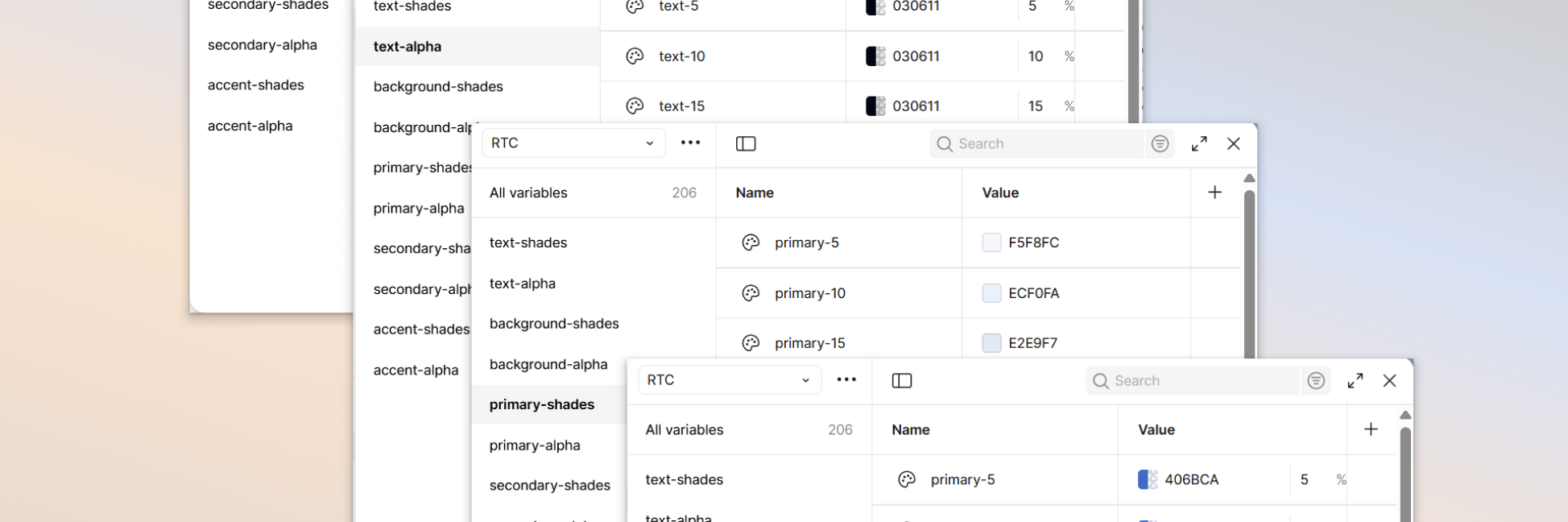
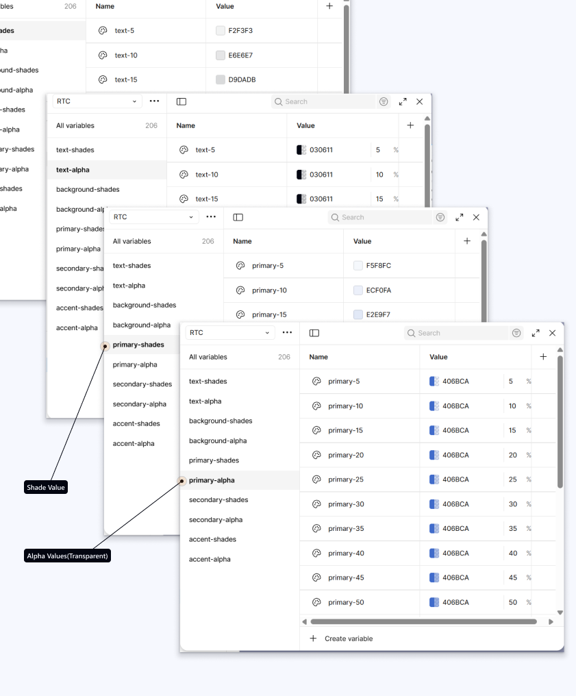
How It Works
When you define your Primary, Secondary, and Accent colors, Inked Colibri automatically:
- Generates shades (solid) and alpha (transparent) variations for each color role.
- Creates values ranging from 5% to 100% intensity or opacity.
- Stores them in a Figma collection named RTC, organized as:
- [color name]-shades
- [color name]-alpha
- Uses a clear naming pattern like [color name]-5, [color name]-10, … [color name]-100, making it easy to choose the right variable while designing.
Design Balance — The 70 / 20 / 10 Rule
Even if you use neutral colors, you can still apply this rule with Inked Calibri variables:
- 10% Accent / First Priority — the most important elements that should grab the user’s attention (e.g., buttons, key highlights)
- 20% Secondary / Second Priority — supporting elements that guide the user subtly
- 70% Primary / Everything Else — the main background and surfaces, typically neutral text shades and alpha values
💡 Design tip: In our workflow, neutral colors are mostly shades and alpha variations of text, because text is the element closest to black with light shades of primary. Avoid using too much color for large surfaces — reserve color only for links, buttons, or key highlights, so the interface remains clear and focused.
More detailed guidance on this topic will be provided in the upcoming chapter.
This simple ratio helps distribute attention naturally and keeps your UI cohesive.
For a deeper understanding of color usage, refer to the official Realtime Colors documentation.